Wednesday, 29 December 2010
Thursday, 16 December 2010
Tuesday, 14 December 2010
Tuesday, 7 December 2010
Monday, 6 December 2010
Tuesday, 30 November 2010
Thursday, 25 November 2010
health and safety Video:
Wednesday, 24 November 2010
Day 2 video Diary:
Monday, 22 November 2010
Day 1 Filming Diary:
Thursday, 18 November 2010
Storyboard;
Monday, 15 November 2010
The smashed car;
Sunday, 14 November 2010
Chosen Poster for ancillary task:
Thursday, 14 October 2010
Christopher Booker's seven basic plots:
Overcoming the Monster A terrifying, all-powerful, life-threatening monster whom the hero must confront in a fight to the death. An example of this plot is seen in Beowulf, Jack and the Beanstalk, and Dracula.
Rags to Riches Someone who has seemed to the world quite commonplace is shown to have been hiding a second, more exceptional self within. Think the ugly duckling, Jane Eyre and Clark Kent.
The Quest From the moment the hero learns of the priceless goal, he sets out on a hazardous journey to reach it. Examples are seen in The Odyssey, The Aeneid, The Count of Monte Cristo, and Raiders of the Lost Ark.
Voyage and Return The hero or heroine and a few companions travel out of the familiar surroundings into another world completely cut off from the first. While it is at first marvellous, there is a sense of increasing peril. After a dramatic escape, they return to the familiar world where they began. Alice in Wonderland and The Time Machine are obvious examples; but Brides head Revisited and Gone with the Wind also embody this basic plot line.
Comedy Following a general chaos of misunderstanding, the characters tie themselves and each other into a knot that seems almost unbearable; however, to universal relief, everyone and everything gets sorted out, bringing about the happy ending. Shakespeare’s comedies come to mind, as do Jane Austen’s perfect novels.
Tragedy A character through some flaw or lack of self-understanding is increasingly drawn into a fatal course of action which leads inexorably to disaster. King Lear, Madame Bovary, The Picture of Dorian Gray, Bonnie and Clyde—all flagrantly tragic.
Rebirth There is a mounting sense of threat as a dark force approaches the hero until it emerges completely, holding the hero in its deadly grip. Only after a time, when it seems that the dark force has triumphed, does the reversal take place. The hero is redeemed, usually through the life-giving power of love. Many fairy tales take this shape; also, works like Silas Marner and It’s a Wonderful Life.
Sunday, 10 October 2010
Brief Gantt Chart for planning:
October - Research (Short Films, Ancillary tasks and Target Audience)
November - Planning
December - Planning (Of Main Task, Review on Review Page and layout)
January - Filming Main Tasks, Taking photos for ancillary tasks
Feburary - Filming Main Tasks, Taking photos for ancillary tasks (Gives us time to film stuff we may of missed out)
March - Editing
April - Editing
May - Evaluation
Thursday, 7 October 2010
Audience Research: Group Interview- Initial Ideas
Wednesday, 6 October 2010
initial Ideas:
Thursday, 16 September 2010
Short Film analysis:
- starting off with the words 'you know too much' going across the screen which they are a little faded as if they are shining through holes.
- starts off with a long shot over a crop field with an aeroplane going over the field. We find out the time from this shot, suggesting it is going into night.
- tracking shot coming vertically down showing a man sitting in the middle of one of these crop fields on a dusty patch of ground.
- it then cuts to a tracking shot with the man running along a path. With a bird flying along side him. This effectively disturbs the equilibrium of the piece.
- as he is running we see a lot of rubbish like old tyres on the floor.
- it then cuts back to him sitting down. His clothes look as if he homeless; with a very baggy jumper and jeans that look dirty, possibly because of the colour.
- jump cutting to a close up of a spider spinning a web, could be showing how the man is going to become trapped or already is trapped. Leaving a sense of question.
- cutting to the man looking around a deserted wheat field with confusion on his face creating a disturbance in the equilibrium for the audience.
- as the pan moves round we see that the man is standing in the middle of a pathway in the field.
- deterring from this path, he starts to run back through the field; possible comment on society and defiance to follow the set 'norm'?
- as the camera tracks the man from behind, we see a darker man running in from the right of the camera screen.
- cuts back to the man sitting down, this short film could be cutting from past the present tenses; the man has an expression of realisation.
- cuts back to the darker man and man fighting over a bag, with the previous man on the floor. this could suggest a sense of inner struggle.
- the camera then cuts to a tracking shot of him face-on with him slowed down to walking pace with the wind against him.
- cuts to a tracking shot of a tree with the camera moving around it. we as an audience expect the man to be in this tree.
- a leaf soon draws the attention in this tracking shot and it is used as a transition for the camera to go back on to the previous man.
- goes to an over the shoulder shot of the man watching as himself and the darker man fight over the bag. Bringing a sense of unknowing of the bag and the state of mind the man is in.
- goes to close up reaction shot of the man.
- as it zooms back into the fighting two men we see the previous man looking at himself asking for help.
- the darker man loses grip of the bag and, the bag is then thrown towards the camera.
- as the bag becomes a close up it moves into another transition through the natural objects in the camera shot.
- the bag is then caught again by the previous man who threw it with a medium shot of the man.
- the darker man begins to chase him again, and the shot becomes over the shoulder of the previous man.
- looks as if the first few seconds are being repeated from the beginning with the man running alongside a bird with a vertical track.
- then cuts to a close up reaction shot of the man as he begins to slow down.
- cuts to a birds eye view of the man running into tall corn fields, cutting to a close up of the mans face with an expression of worrisomeness.
- as an audience then see why the man is scared, the camera cuts to a close up zoom in of the darker man who has an expression of anger on his face.
- cuts to a pan of the field, then to the horizon eventually panning into grass.
- cutting the leaf we saw earlier which made a transition being carried by the wind along a lake.
- cuts back to a close up of the spider with a view of the sun which has gone further down now, yet more disturbance in wind making the web look less neat than before.
- cuts back to the two men, as we see the darker man fall over from a medium long shot.
- goes to a vertical track of the horizon showing how the sun is going down and it is becoming darker whilst the camera follows the leaf.
- goes to the leaf getting caught in the spiders web, bringing more mystery to the mans entrapment.
- repetition of the man looking around confused with a medium shot pan, except this time he walks along the path.
- cuts back to the spider with the leaf in the web, spider could possibly representing the dark character in this piece of media and the leaf representing the other man.
- cuts back to the man running along the path as well as zooming out as the man is getting further away.
- then cuts to the darker man running, with a pan following his running direction.
- tracks aways from the darker man where we see the previous man hiding behind a tree.
- going into a close up reaction shot of the previous man checking to see whether the darker man has gone.
- cutting to a pan from behind the man moving up from a close up to the back of his feet to a long shot of the man walking in the field.
- goes to a dark screen with the the name of the short film coming up as it did at the beginning.
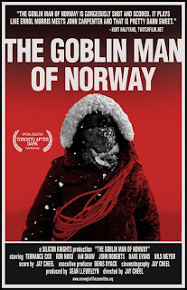
The poster for a short film is a lot like a poster for a normal film. the main difference is the reviews they display on the poster. Usually we would see a number of stars displayed if a film was seen to be a good film by critics. Yet we do not see this on a short film poster we see reviews from a less known company or agency. On this poster design it seems quite simple, due mostly to the possible low budget for advertisement. In the background of the poster, the color red is apparent suggesting a sense of death, as well as the thing that is the focus of attention in this poster. We are immediately drawn to the 'alien' in the picture because of its unusual appearance. The typography is very simple with a white font color
Short film analysis - The suit (Douglas Ray):
- the piece starts with the distribution logo and name.
- a very fast pan to a medium shot of a well dressed man we can assume that the location is set in London because of the scenery.
- cuts to a front on tracking shot of the man talking about his job being a lawyer.
- the building in the background as an audience can assume this is the place that the man is walking towards for work.
- the very fast pan works as a transition so they can smoothly cut to the next shot of the man walking being tracked front on.
- the tracking is then stopped as the man stops walking as he says a firm statement.
- cuts to the man on the tube, where the narrative voice is introduced for the first time in the piece.
- the narrative voice is used basically to describe the mans actions and facial expressions.
- cuts to close up tracking shot of the man as the narrative voice carries on to describe the job.
- cuts to a still shot as the man walks up to camera with an expression of boredom on his face.
- goes to a black screen, as 'the suit' comes up in bold white letters in the middle of the screen.
- cuts back to a tracking shot front on of the man walking, with people in the background of the shot.
- cuts to the man's office and a close up as he whispers to the camera his hate for his job as if the camera is the man's friend. This could suggest that the camera is the view point from someone else's eyes.
- cuts to the man being tracked front on again as he talks about how no-ones hate for their job can compare to his, with a slight smile on his face.
- cuts to a long shot of him sitting at his desk in his office, from what we see, his office is very messy with papers all over the floor and a poster hanging on the wall by the corner of the poster. This could show his further hate towards his job for he does not take much care of his work or office.
- The narrative voice talks over his actions, and from what we can see he looks quite frustrated.
- goes to a medium shot of his hands on the mouse and keyboard of the computer. With more untidiness displayed on his desk.
- goes to a behind shot of the man working on the computer as the narrative voice says 'pretend I'm working'.
- cuts to a close up of the computer screen with 'English Law' wrote on it, suggesting the man doesn't know much about his job.
- cuts to a close up of the mans face which looks confused as he looks at the computer screen.
- it then cuts to a side-on shot of the man and his computer, suggesting that they are on different sides battling one another.
- cuts to a cupboard which is described as a 'forbidden cupboard' giving a sense of mystery about the cupboard.
- as the cupboard is opened, we see the man hiding more of his work load in to this cupboard showing his laziness and lack of work.
- it cuts to a low angle medium shot of the man as the cupboard is closed, the man looks quite confused and shifty.
- cuts to a medium close up of the man standing still telling his depressing story as people in the background are smiling and laughing in the shot.
- cuts to a medium shot of the man holding a 'ready meal' in a supermarket, the camera then pans up to the mans face as he explains.
- cuts to the man being tracked front on once again in the street, with the streets much busier this time.
- cuts to a different scenery and color, the effect could possibly be infer red, as the narrative voice explains the peoples excitement.
- cuts to a zoom in of the man from a medium shot to a close up, showing his upset and depression with people having a good time in the background.
- cuts to a medium shot of the man looking very blankly at nothing, as he looks at his hand, the narrative voice provides a description of his hand.
- cuts to the man in his house in his pajamas looking quite scruffy and suggesting he has just woken up and it is morning.
- cuts to him in the bathroom adjusting his tie.
- we as an audience see the unsteadiness of the camera now, and it becomes clear that a tripod was probably not used.
- goes to a tracking shot from behind with the narrative voice describing his existence's importance.
- cuts to the other side of the room and we see the man coming head on, with his tie adjusted the wrong way, this could be a low comic undertone to his depressive speech, as it follows the man in a pan.
- cuts to the man pressing the button for the elevator.
- it then cuts to the man in the elevator looking quite angry as the narrative voice carries on talking for the man. This could suggest his self esteem has become lower and lower because he begins to speak less and less for himself, yet he says it all through narrative speech.
- cuts to the man standing next to a poster with a man in a suit in the picture. This corresponds with the mans speech as he has just talked about how fake men are who wear suits.
- it then goes to a high angle shot looking down on the man on the escalator.
- as he talks about being a hero and the train stops we see through the window the word 'hero' which was on a poster being the tube.
- it then cuts to the man running into a phone box, this is a reference to superman who changes from a suit to a costume yet he walks out of the phone box retaining his regular wear, because he has no choice than to be a lawyer.
Sound:
In this media piece the main sounds in the film are digetic. We hear a lot of dialogue in this piece, we plan to use very little dialogue if any, because we feel that this lessen the impact of the piece. The main sounds come from the narrative voice that speaks a lot for the man. The other noises come from objects and are digetic for example when he closes the cupboard doors or when he gets on the train. The disadvantage of using mainly dialogue is that it sounds different in different rooms and can echo for example when the man is talking to the camera in the bathroom, the echo has not been dealt with in that room. The main advantage of using dialogue in a piece is the amount of information it reveals about the plot of the storyline.
Credits:
The credits are quite basic, goes to a black screen and the director and actors name come on at the side of the screen. It cuts from the black screen to the man again where he says one last statement, and goes back to the black screen where it says why the film was made. As well as showing at the end the distribution and producing company's name and logo which is of course the BBC.
Friday, 9 July 2010

Tuesday, 22 June 2010
Practice with panning from the ceiling:
Monday, 21 June 2010
Further Album Cover Analysis
A Rocket To The Moon (Album cover):
- As we can see from the album cover, it has the bands name on a sort of hill type of lining, and the typography of this title, looks as if it has been wrote by hand onto the album. The albums name 'on your side' is smaller to the bands title, which is quite typical of most album covers, it is quite common for the producer of the CD to use the bands name in a more outstanding and bold style.
- The colours used on this album cover are quite relaxing and mellow. For example the connotations of the colour blue are calm atmosphered and quite relaxed. The colours seem blurred as well as being quite bright, so it could be suggested that it looks as if the scenery is being seen through a window or a clear pain of glass.
- The windmill in the background suggests a sense of peace to the music which may be seen on this album, from what we can see by the lyrics and music of this band the music is quite calming and peaceful. The bird which we can faintly see in this album cover picture, could be also representative of this peaceful music.

A Rocket To The Moon (logo):
The logo of this band, seems quite retro, as if it should be from the 1960s possibly. The reason this could possibly be perceived this way because of the colours which are used. For example they all eventually come together at the bottom of the title. Also the word 'moon' starts to become an underline for the rest of the word, which adds to that 'groovy' type of effect. As well as the title not really having any paticular straight lines in it at all, and it is quite curved it brings a sense of fun to it. The 'groovy' type of feel to this title also adds to a representation of the songs, except these songs are quite modern, with lots of different generic sounds.

A Rocket To The Moon (poster):
The poster features the three members of the band all looking very relaxed towards the camera. The lead singer is in the center with the other two members behind him, suggesting a sense of importance to him, yet this is used in a lot of posters with the band members appearing on the poster, usually the lead singer will be in the center or have the most space given to him/her on the poster. The bands name is in the bottom right corner, the style of this writing looks more of a rap sort of look to it because it has been done in a stone colour with quite hard hitting lettering. The setting of this poster looks as if it has been set next to a block of houses, yet it also looks as if it has been set in the back garden of someones house. This suggests a limited budget possibly because it is not a well known band and does not have very many fancy effects in the videos.

A Rocket To The Moon (Music video):
- It starts with quite a playful tone to the music, and a shot of a frog, speech bubbles come out of the frogs mouth about 2 seconds into the video and first show the bands name, and the song title 'Baby we're invincible'.
- Then we see a shot of a multi-coloured tie and sunglasses and some other objects, these could all represent the upbeat qualities that the song has to give. Shooting to shoes on a floor, underneath a bed.
- We see the lead singer in bed, acting in as a character for the music video which is quite typical, most lead singers do feature as main characters for their own music videos. We see him asleep with a thought bubble of him about to sing.
- The lyrics begin and we can assume that it is coming from a speaker phone on the side of the characters bed because sharp animated symbols pop up over the speaker suggesting that it is digetic sound.
- We see the character stirring out of bed, and switching off the speaker/alarm clock, this then shoots to the band going back to the characters bedroom as he gets out of bed.
- The bedroom has lots of different toys and games, suggesting a sense of playful qualities to this song along with a little bit of innocence. We then see an animated character, possibly an imaginary friend, or some sort of cartoon played out in the characters head, who is starting to stir out of bed also. This could be an idea to use in our media project juxataposing cartoon with reality.
- The character then gets into the shower, the steam is seen to be fake, which is a nice added effect to the video yet it is done quite simply final cut or even just a slight transition, this adds to the merging of the cartoon and reality qualities.
- The 'imaginary cartoon friend' passes a cartoon character, which as the main character of this video, takes it becomes a real towel, this would work well in our preliminary exercise because it would help to test skills we havent used.
- It then flashes to the cartoon and real character sitting on the sofa playing a video game with the cartoon winning, and reality losing in some respects, which also adds to the idea of playfulness in the video.
- The speech bubbles are used again by the friends of the main character who tell him to come with them. It then shoots to a different room, like a basement, and we see the band start to play as the 'climax' of the song comes to the point.
- In the climax of this song we see the lead singer/main character pushing away his imaginary cartoon friend, and we see the cartoon pick up a ball and it immediately turns into an animation. The main character then falls over and gets knocked unconscious with animated stars which then start to come over his head, which is how we assume he has been knocked unconscious.
- He then meets a girl and the cartoon is forgotten about which is possibly a little message at the end saying we forget all the childish things as we grow up into adolescence.
Friday, 18 June 2010
Album cover analysis
Linkin Park (Album Cover):
- As we can see from this album cover is only has 3 different colours and a lot of different shades. For example the bands name, 'linkin park' is quite dark but looks as if it has been worn away at, seen from the little bits of white we can see in the title. The attention is focused around this title, and is boxed slightly with corners of a rectangle put around this title, trying to draw focus to this bands name.
- In the bottom right hand corner of this album cover it shows the albums name in brackets, this could possibly be a message to the market saying that the albums name is not important, because it is not wrote in any particular font and is not in huge size, this could suggest a sense of less importance to the rest of features of this cover. The main definition of Hybrid is the product of dissimilar of two things, which brings a sense of mystery of this album.
- The man who seems to be running in this cover seems to be wearing an army type of uniform and holding some sort of long Axe or flag possibly. This could represent a sense of loneliness associated to the songs or possibly the band, but this is only a speculation.
- The back of this album, is quite basic, has the list of songs, bar code and the album name and bands name on it again. Something that is quite unique to this album cover is that the producers have put how long the songs are on for next to the song names, which is quite different to most album covers. The album also features the bands logo on the back.


Linkin park (Logo):
The linkin park logo, has quite an unique urban association to the logo. The 'p' in this logo is actually the wrong way round, but this sort of style is used in all of the bands logo. It also looks as if it has been spray painted onto a wall, suggesting a sense of street like qualities to the band and the songs. It is also sort of boxed which is used around most of the words on anything that linkin park is associated with. Finally the letters are put in a white colour onto a black background, as well as the bracket border is also put in a white sort of colour.

Linkin park (poster):
This poster is put in a red sort of colour, as if it is a picture in a dark room. The bands name is in top center suggesting great importance so anybody looking at the poster can assume immediately that the band that is being marketed here is called Linkin park. The band members actually appear on this poster, there are six members and each of them have a small picture of them performing live at concerts which has been put in black and white to suggest a sense of memory to it, as if it is only a memory type thing. The members also appear in the background of this poster. The man from the album cover of 'hybrid theory' also features on this poster as well, which could suggest that this poster was published at the same time the album was produced. The butterfly wings added to this man, is quite a contradiction, because a butterfly is seen to be quite a beautiful creature and man of war is seen to be quite brutal so it is quite a big comparison.

Linkin park (music video):
- From the first shot, we see a girl looking over some sort of building or bridge to sea, then goes to a shot of the landscape of a lot of houses which are quite basic, with one half lite by natural lighting and one half still in shadow.
- We then see the band playing in an abandoned place, from some symbolic objects and candles we can assume this location is most probably a church of some description or somewhere religious.
- It then cuts to a classroom with the teacher at the front of the class pointing out things from a black board, and all the students except from the girl before are all watching and listening intently, yet the girl is drawing. From what we see of the drawings, they could be perceived as angels.
- It then shows the teacher banging a stick onto the desk of the girl because of her lack of attention, as this happens the other students begin to laugh at the girl bringing a sense of victimization of the girl.
- We see a statue of a woman with a man at her feet, whilst she is holding a baby, which looks quite religious, this whole video seems to link back to religion, because of the lyrics, the locations or just the drawings.
- We then see a sped up version of everyone else around the girl, when the chorus comes into the song, this could highlight her alienation and loneliness. The girl is then pushed over by another girl, we start to assume that this girl will most probably commit suicide.
- The viewer then sees the relationship between the girl and her mother, yet this is quite contradictory to the lyrics of the song at this point 'cant you see that you're smothering me' when the mother is actually arguing with her daughter and the daughter seems to be ignoring this and just looks upset.
- We then see the video becoming more blurry possibly because we are seeing it from the girls perception and that she is starting to think quite negatively and shut her eyes to everything.
- The girl then tries to sit with some other girls with her lunch, this highlights her alienation when we see the other girls get up and leave her without saying anything, the people then speed up around her again, this could symbolize how she feels as if she is going no-where compared to everyone else around her.
- We presume that the girl has just self harmed on her wrists, as she ties up her hair, and starts to look into a mirror. She then starts to aggressively paint on a canvas as the song comes to a climax.
- At the end we see the girl running towards where the band had been playing, except they have disappeared, giving us a question of whether they were ever there, although the equipment they were using is still scattered around where they were playing.